Building from scratch, an instant question-resolution platform for 8th to 12th-grade students in India

introduction
The founders of the startup approached me to develop a product for them from scratch over a period of almost one year.
The business statement given to me by the founders was:
'Making education accessible for all by connecting tutors to students in need-instantly.'
As a founding team member, I had the task of ideating the entire product, keeping in mind the needs of the stakeholders, and ultimately delivering a product that could meet consumer demands.
duration:
8 months (November 2020 - June 2021)
team:
6 (1 Product Designer, 1 Visual Designer, 3 Developers, 1 Product Manager)
role:
Product Designer
focus area:
Interaction Design, Design Strategy and User Research
Imagine being a student in India with limited access to tutoring services outside of school.
When you encounter a problem solving a STEM question and need external help, hiring tutors isn't an option due to cost.
This situation poses a challenge as students face significant cognitive load in attempting to solve the question, and the lack of external support can cause stress.
The key challenge is to connect students with tutors who can provide quick and seamless assistance whenever they have a query.
the problem
the process
the solution-DoubtConnect
An Android mobile application designed to bridge the educational divide by connecting students with India's top tutors in real time through video calls. Students are charged based on the number of questions they ask, rather than a flat tuition fee.
the impact
32,000+
students have used the platform to solve their questions since the launch, starting from zero.
1000+
tutors onboarded onto the platform, providing them with an additional source of income.
100,000+
minutes of learning conducted with over 80,000 questions solved, since the launch.
*these metrics were last updated in December 2022, subject to change.
conducting research to better understand the space
Competitor Analysis to Examine Key Players in the Market
To understand competitors' unique selling points and their student-tutor connection methods, I experimented with their products for a week.
-
Unacademy and Byjus offer live classes scheduled by the company, similar to traditional classes.
-
Byjus also provides one-on-one classes, but they require prior scheduling or are available after group sessions for personal doubts.
-
Cangelo and DoubtBuddy offer individual sessions where students send questions as images and get replies via text.
-
Toppr and DoubtNut answer questions using OCR to find answers online or in their database, presenting them as images or videos.
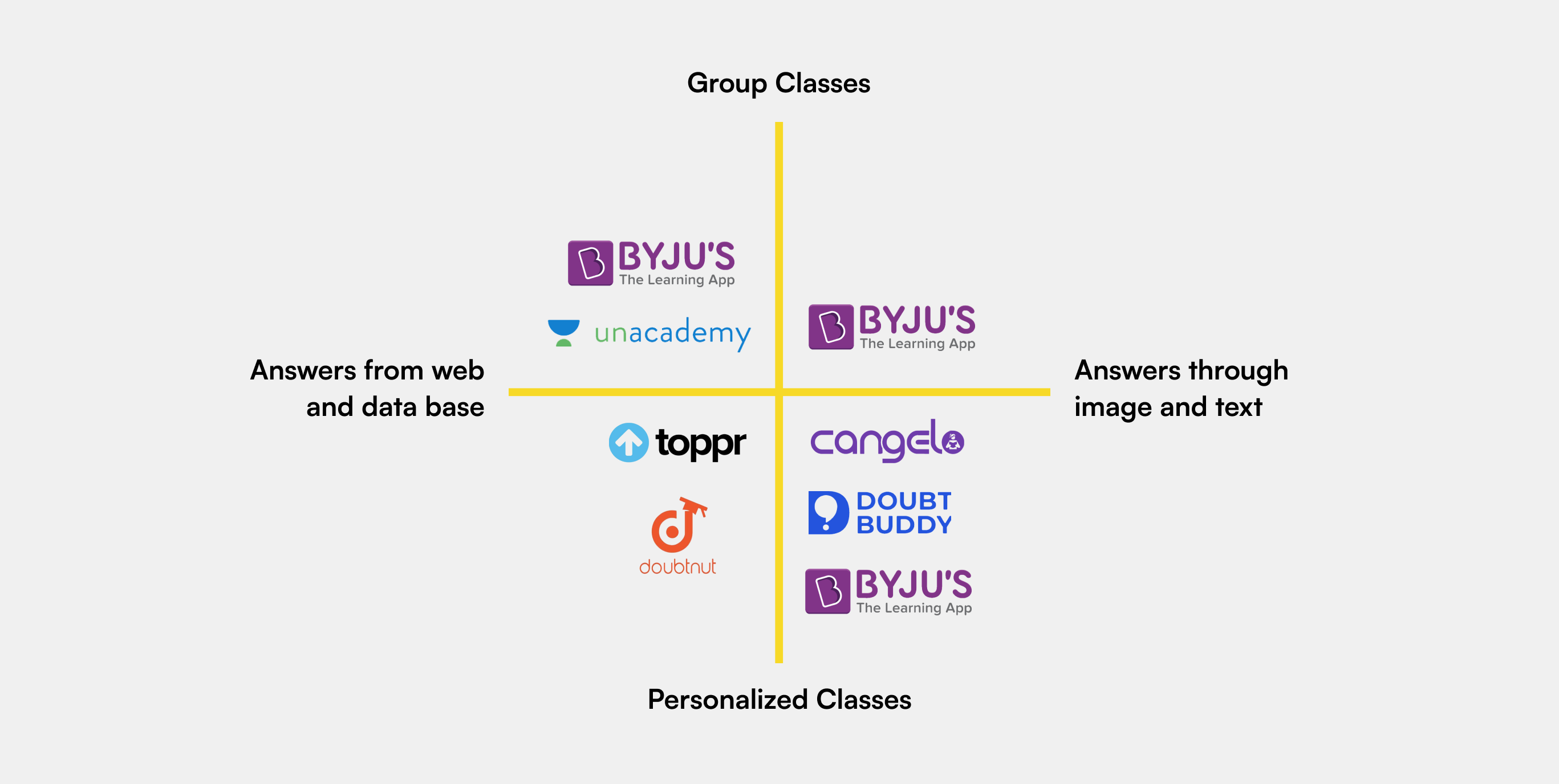
how is DoubtConnect different from its competitors?
Based on the above research, I identified the product market fit for DoubtConnect.
DoubtConnect provides personalized, one-on-one lessons where questions are answered immediately through video calls, with speed and the constant online presence of instructors serving as key differentiators.
None of the existing players in the market have tapped into this space yet.
Creating User Personas to Humanize Our Audience
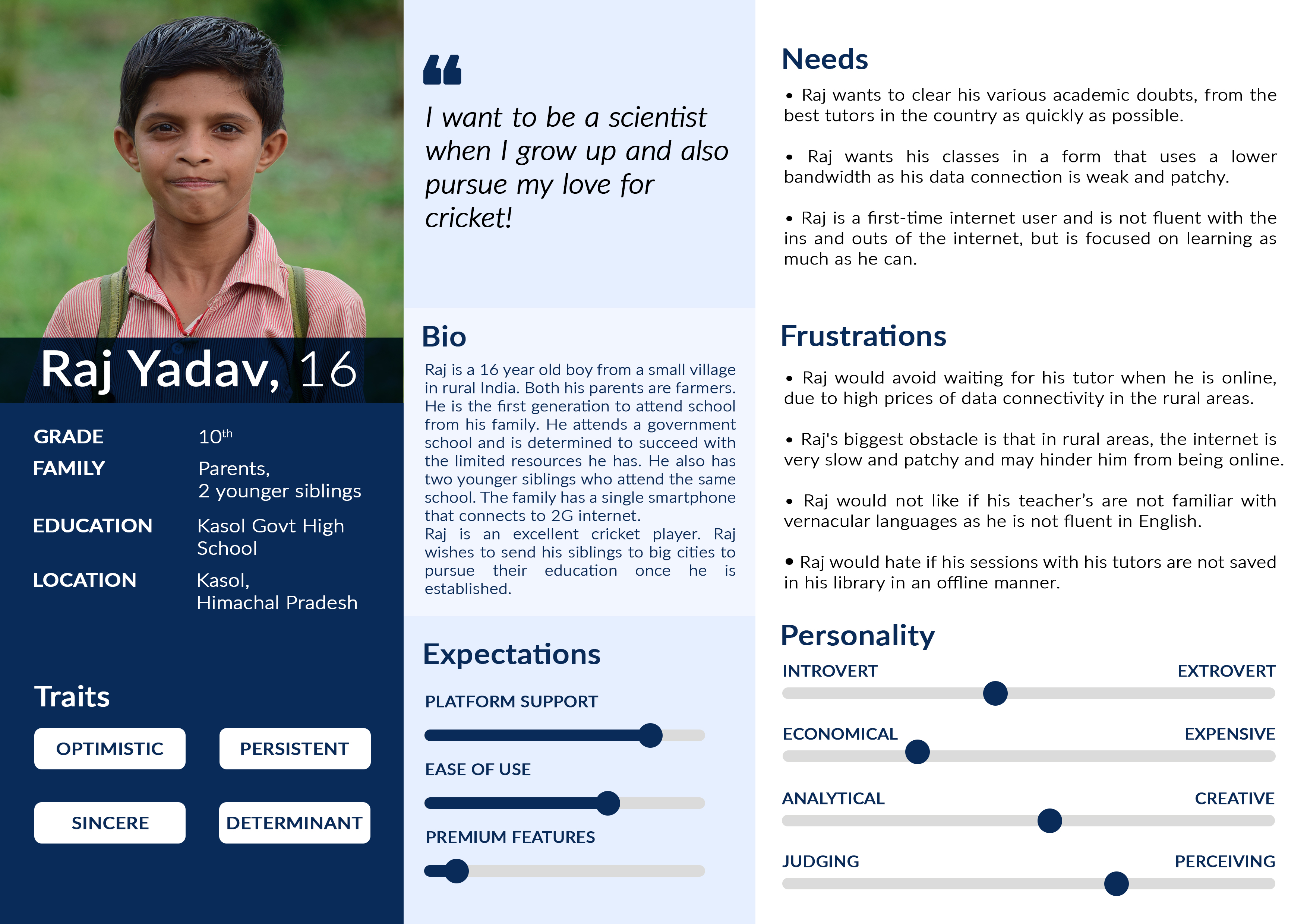
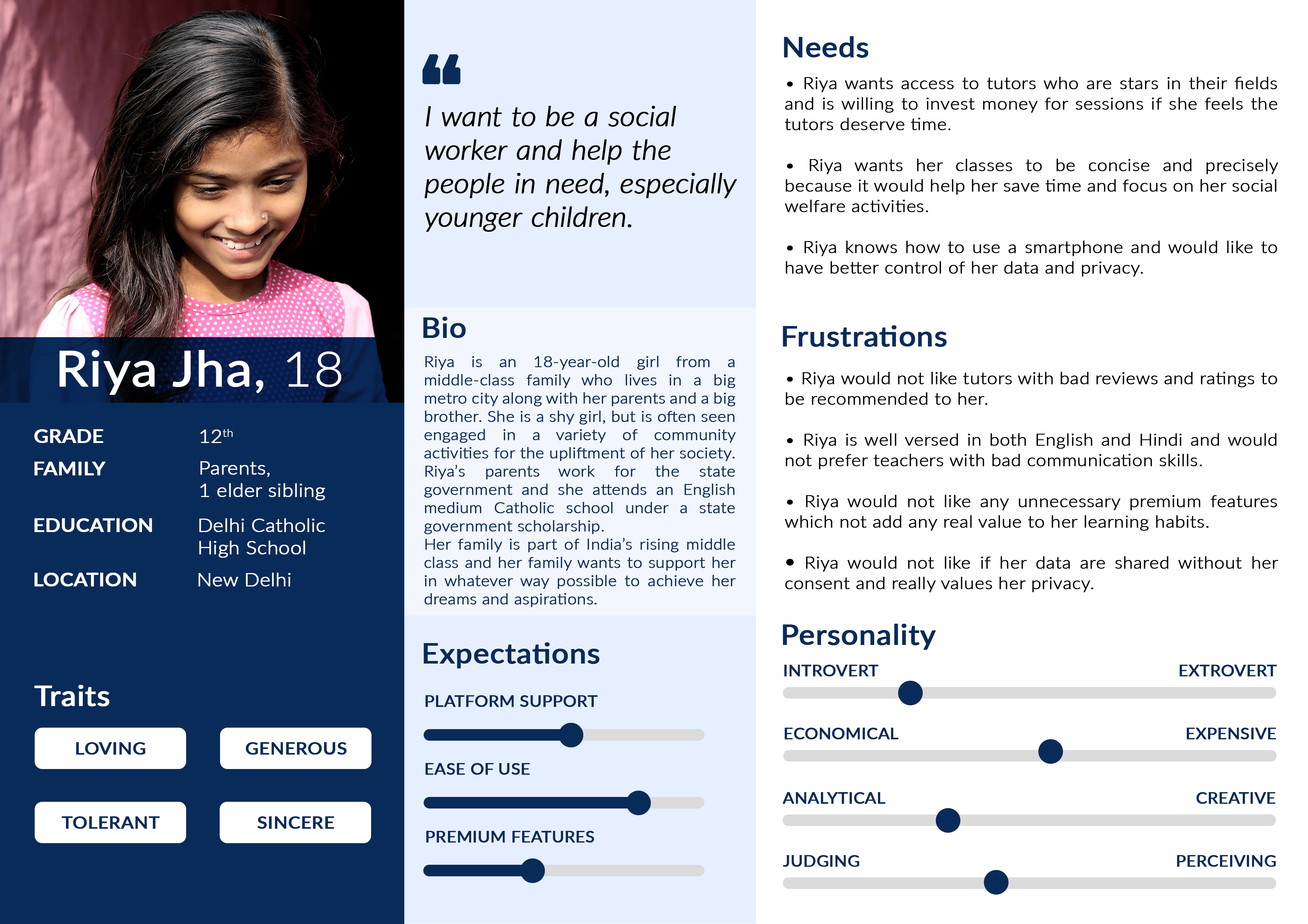
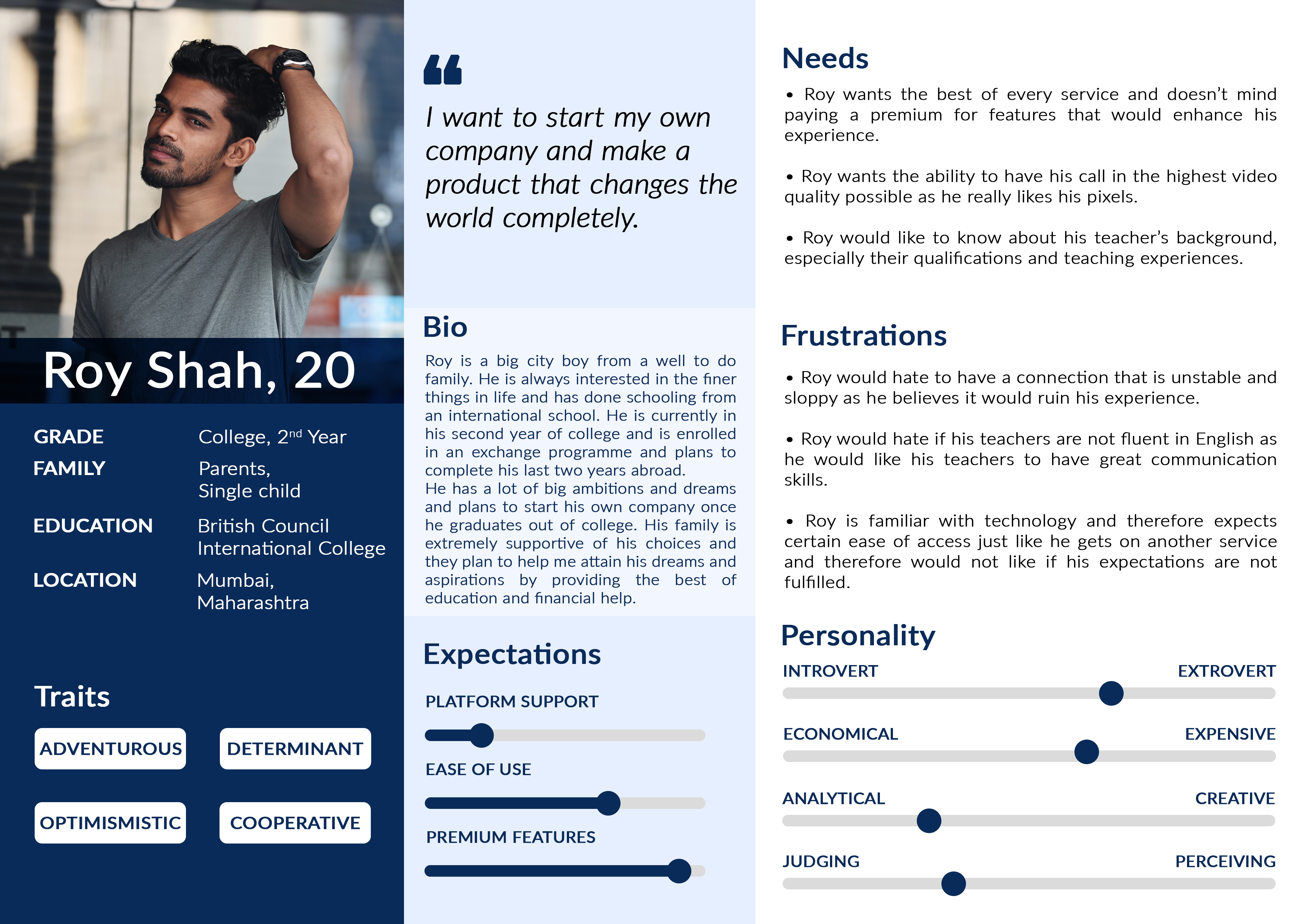
The personas were created keeping in mind the economic backgrounds of the students as the stakeholders wanted the product to be a subscription service and therefore, wanted to have an idea about the target user base.
#Persona 1: Students from low-income families
#Persona 2: Students from mid-income families
#Persona 3: Students from high-income families
so, who is our target audience?
From the above personas, we realized that DoubtConnect can only cater to students from mid-income families, for two reasons:
Students from low-income families, especially in rural India, cannot afford the monthly subscription costs, even if they are very nominal, and often lack a stable internet connection for video conferencing.
Students from high-income families often tend to hire private tutors for out-of-school learning.
Talking to Our Users Directly
I conducted semi-structured interviews with 5 students from Grades 8 to 12, focusing on their use of online educational tools, the challenges they encounter, and their behavior during online classes.
The goal was to gather qualitative insights into their use and desired features for improved study experiences.


Key Insights from the Interviews
Rigid Timetables
Tutors still tried to maintain the rigidity of traditional classes by introducing timetables and fixed sessions.
Small Viewing Area
Many students felt difficulty seeing the video clearly because the medium they were viewing was a phone with a small screen real estate.
Hesitancy to Group Classes
Pupils feet hesitant to answer and ask questions to the teachers in group classes even though they get the opportunity to ask.
Revisiting Previous Questions
Students want to revisit questions that they ask during the classes later on when revising and existing players didn't allow that.
ideating solutions to narrow down the scope
Brainstorming Product Features with the Team
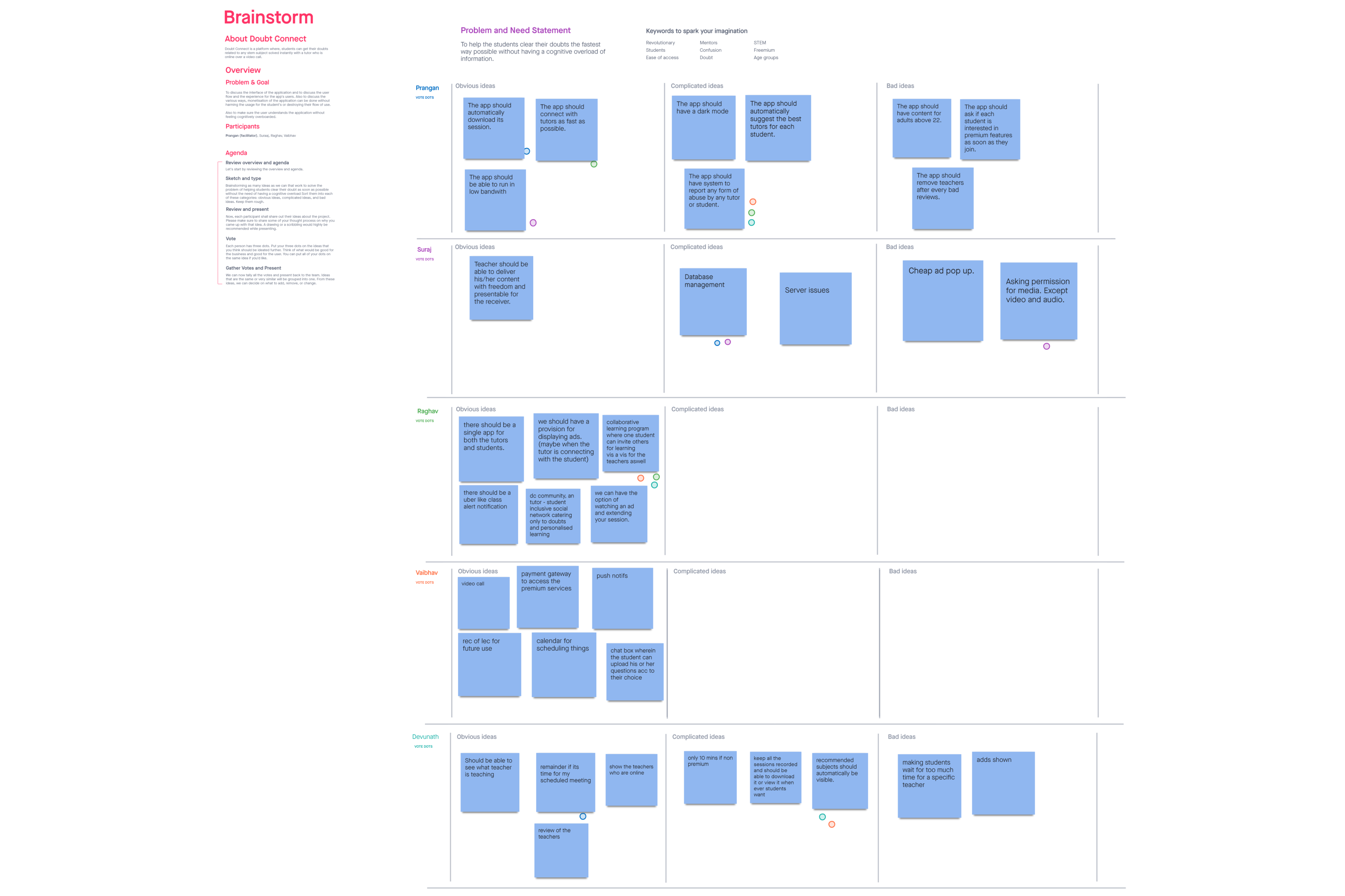
I facilitated a brainstorming session in which the entire team working on the product participated.
In the session, ideas were divided into three categories: Obvious Ideas, Complicated Ideas, and Bad Ideas.
Voting was done using the dot method of voting, where each participant had three dots, and they could vote for any three ideas of their choice.
The goal was that the ideas with the most votes should be ideated further, as they would be suitable for both the user and the business.
what did we find out as a team?
In this session, we came up with an important feature we hadn't thought of before: a system to report incidents.
This is crucial for user safety, especially since most of our users are minors.
Creating a User Flow for Connecting Tutors and Students
Since now we had a foundation on what to include in our designs, I tried to establish a path that both the tutor and the student would follow while using the application.
Mapping Out Front-End and Back-End Processes
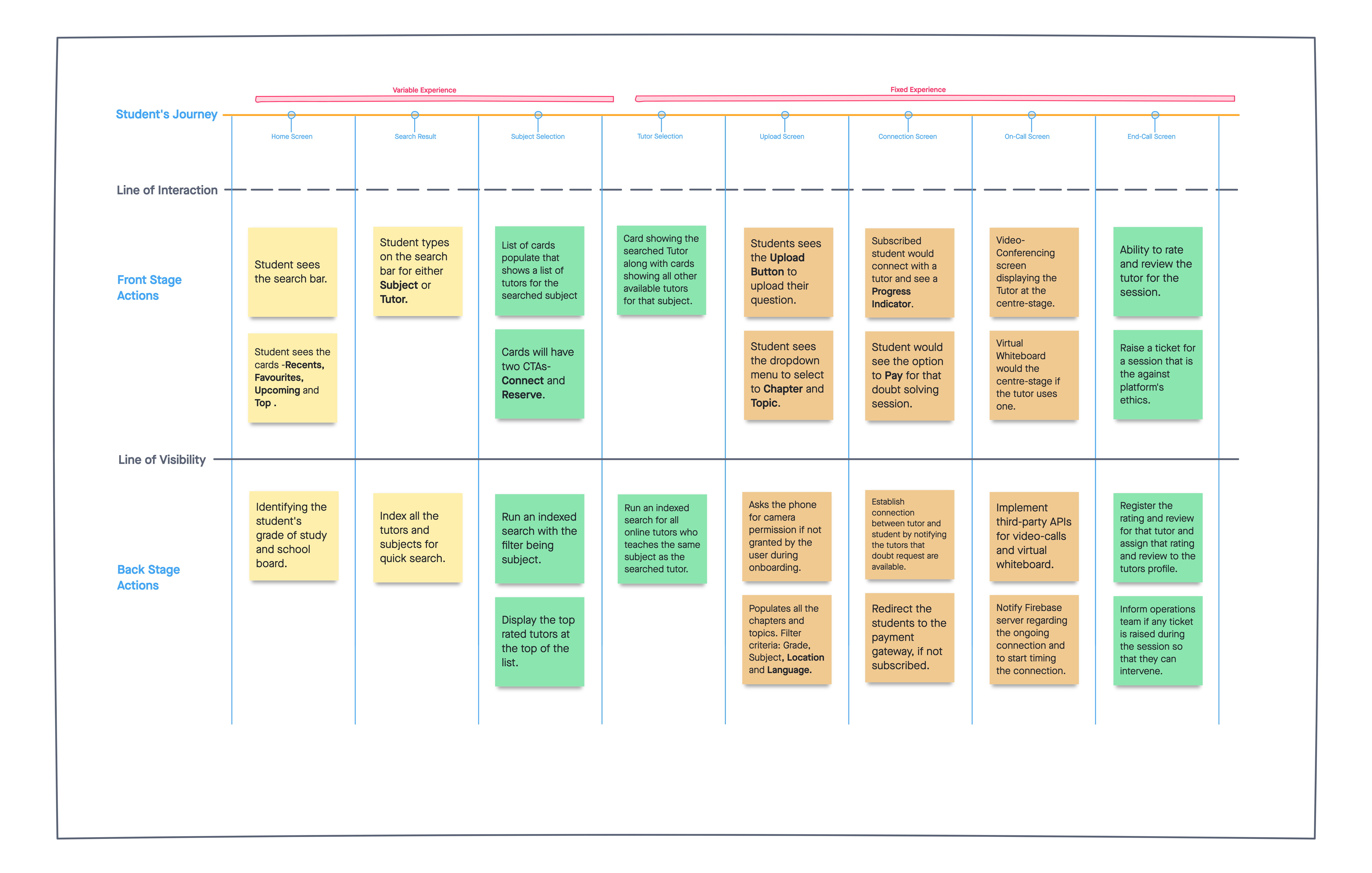
It was essential for me to make a service blueprint for the student's journey as it helped us (both me as the designer and also the developers) to identify both the front-end and back-end processes needed to support the user behaviors during an active session.
sketching out the wireframes
The product has over 50 screens, and it went through multiple iterations before getting shipped.
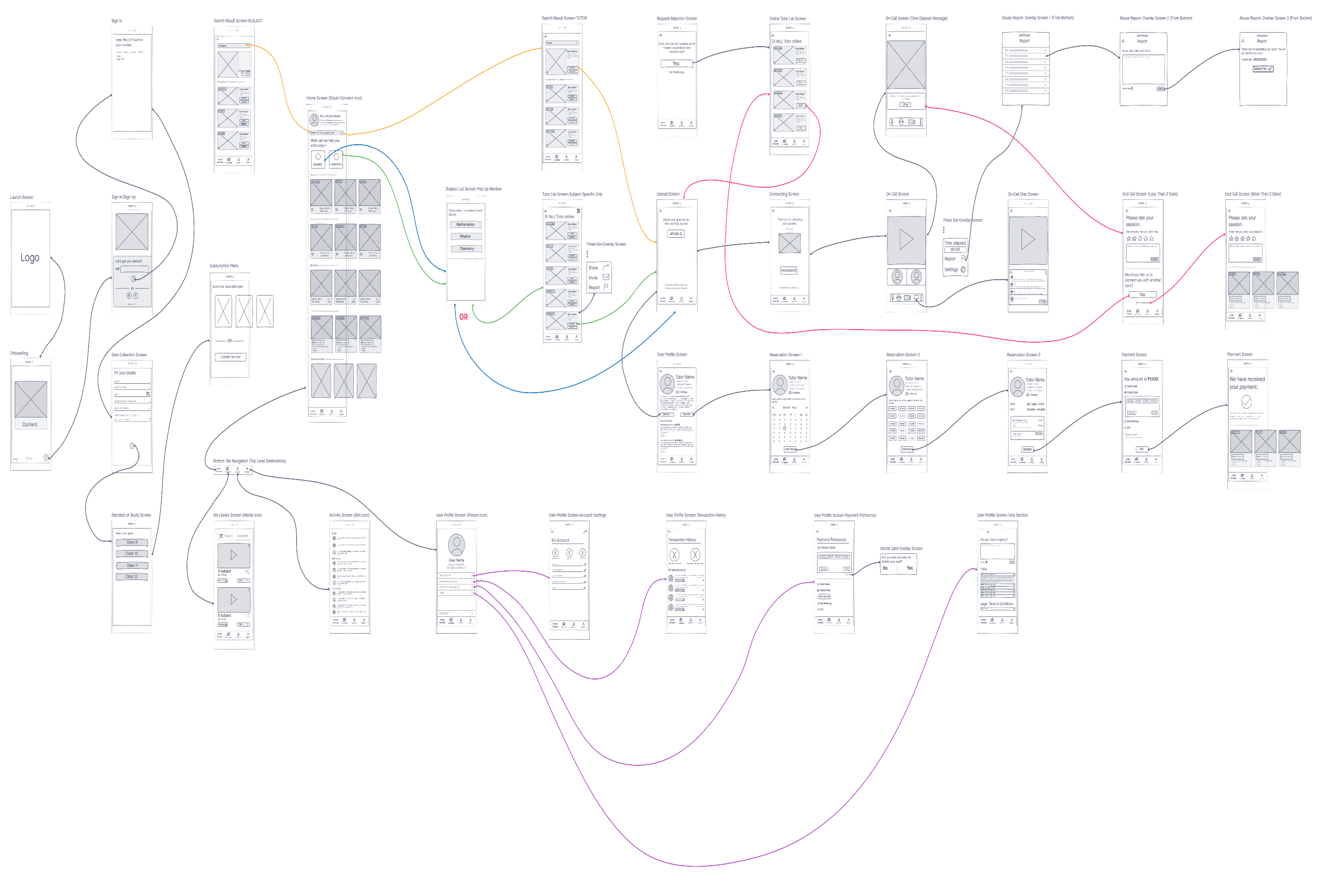
Student Section
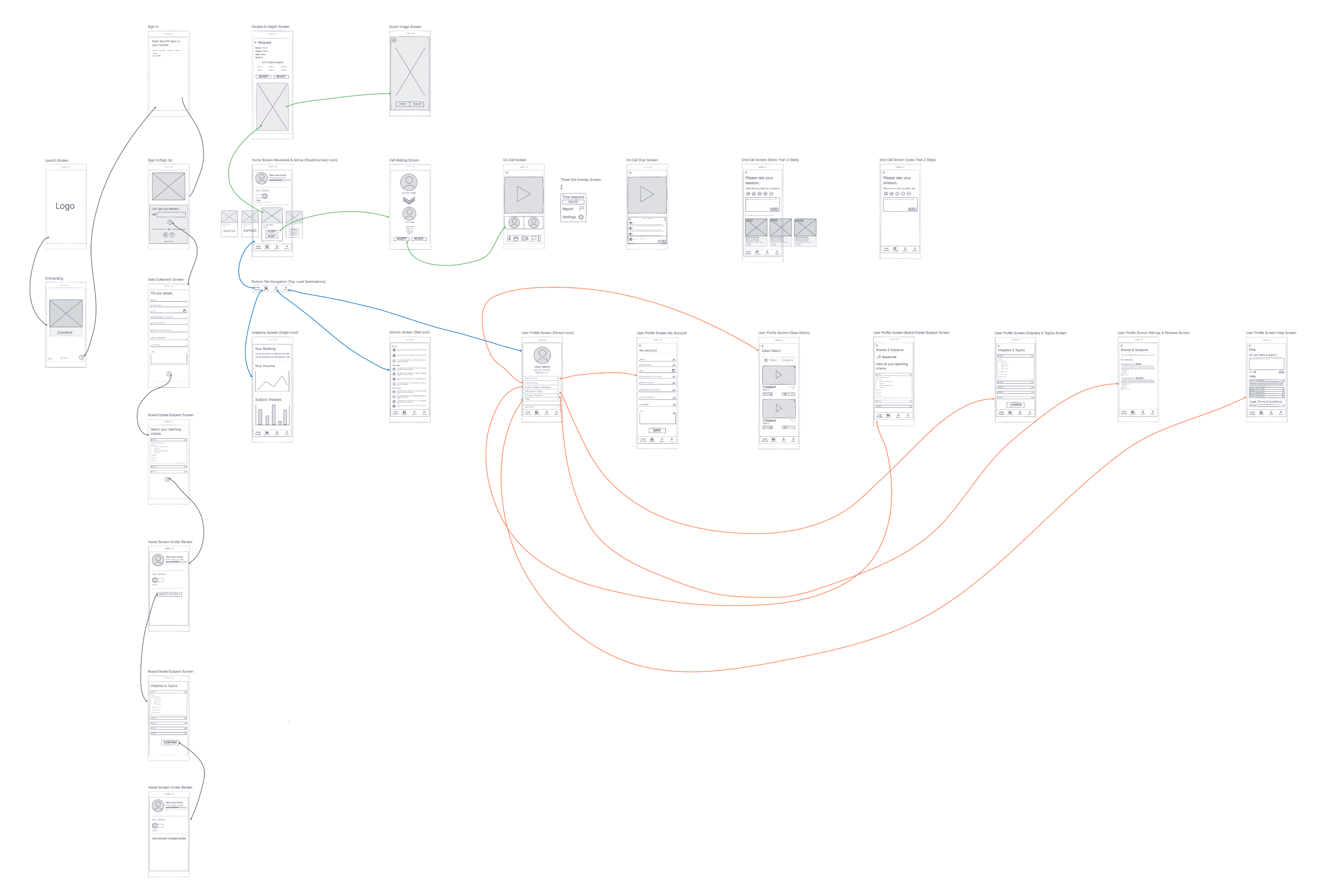
Tutor Section


please note
The product has two parts to it, a student section and a tutor section.
In this case study, I am only presenting the home and the library screen of the student's side of the application to keep it short.
If you are interested, I can walk you through the other screens as well.
the final design
how students connect with tutors on the home screen
The home screen for the students went through multiple iterations before the final product was shipped.
iteration #1
Design Approach
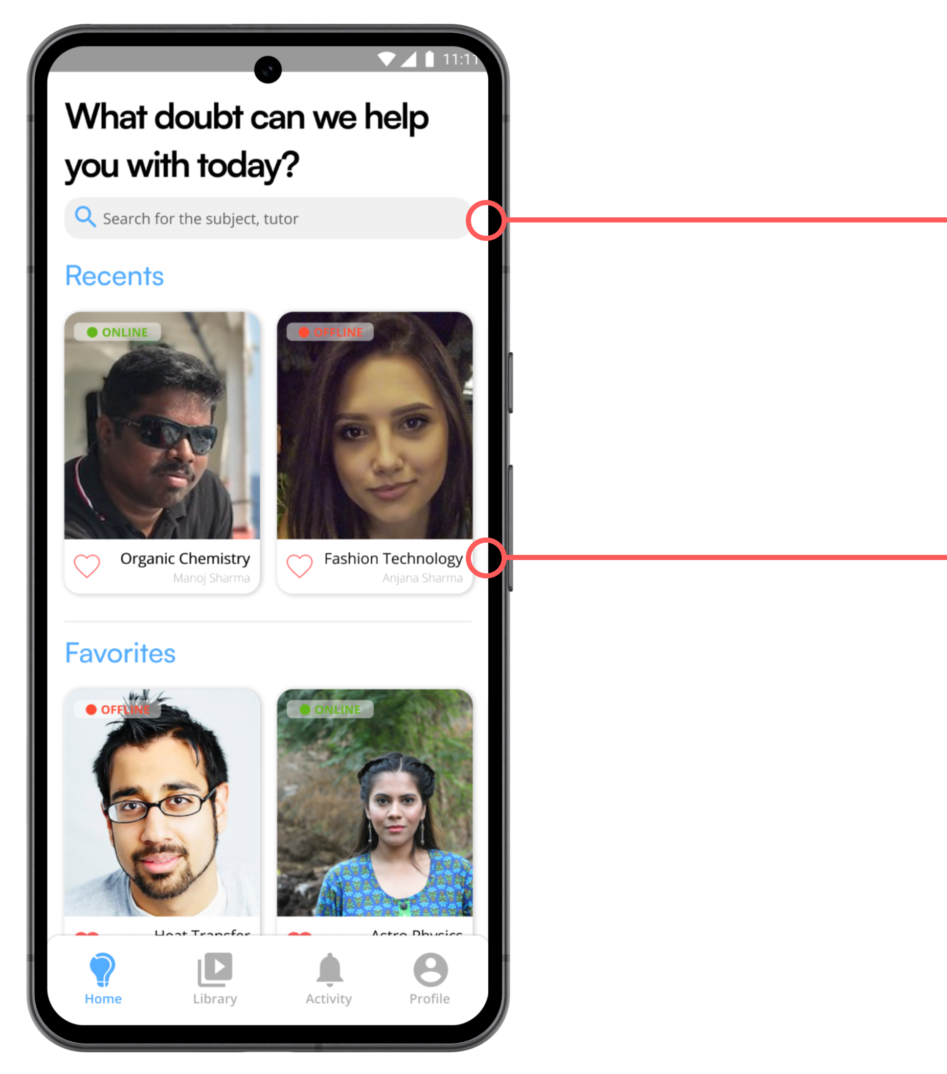
Students would search for a tutor or a subject using the search bar.
A card system was designed to display the list of the tutors with whom they had a recent class so that can easily connect with those tutors quickly if any queries arise.
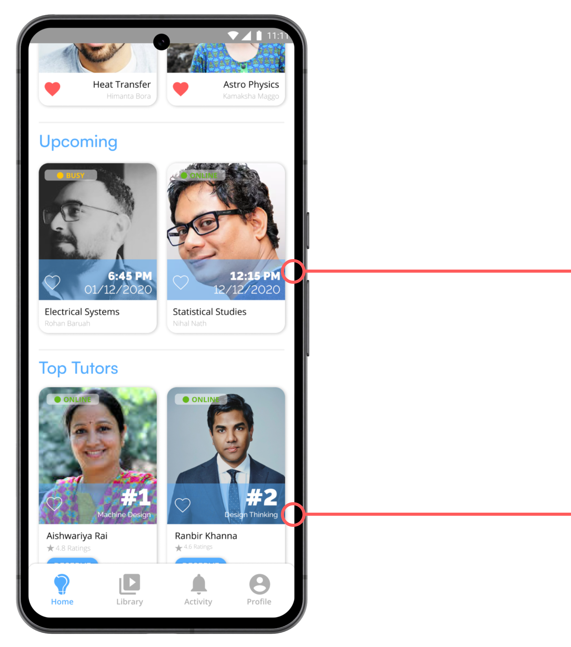
Students can see the list of upcoming sessions with the tutors if they have pre-booked a session.
The "Top Tutors" section of the platform, is to incentivize the tutors to spend more time on the platform to balance the student-tutor ratio.
the problem
-
Humans make spelling mistakes, and that is a human behavior that we as designers have to respect and improve our designs to cope with. Users would often type spellings of the subjects wrong, and the prototype would fail to understand what they meant.
-
3 out of 5 students felt the whole idea of searching for a subject or a tutor was too much work. Therefore wanted the steps to be reduced for the entire process.
iteration #2
Design Approach
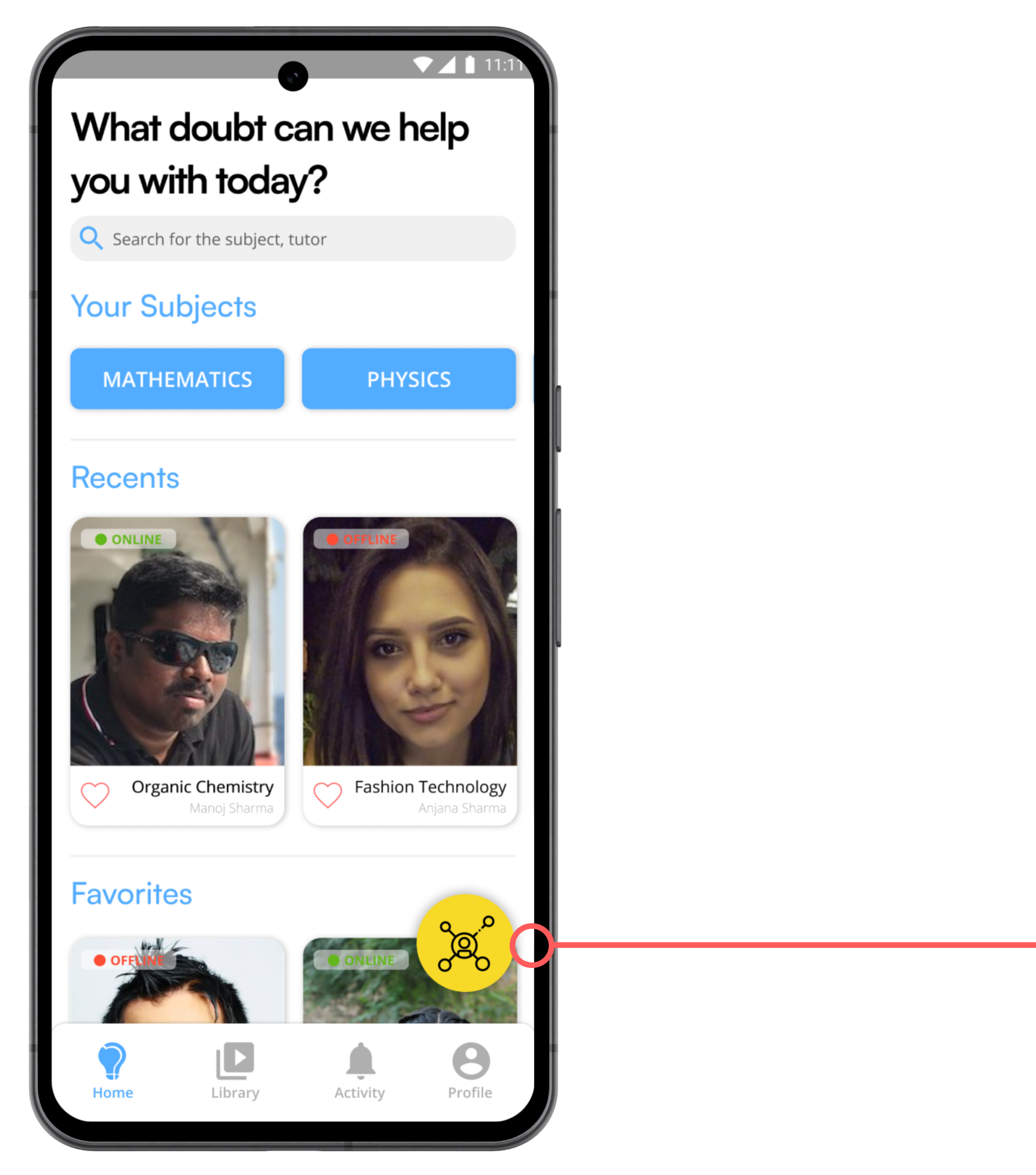
A Floating-Action-Button (FAB) was added to the application so that students could quickly select a subject and bypass the whole process of searching for a subject or a tutor.
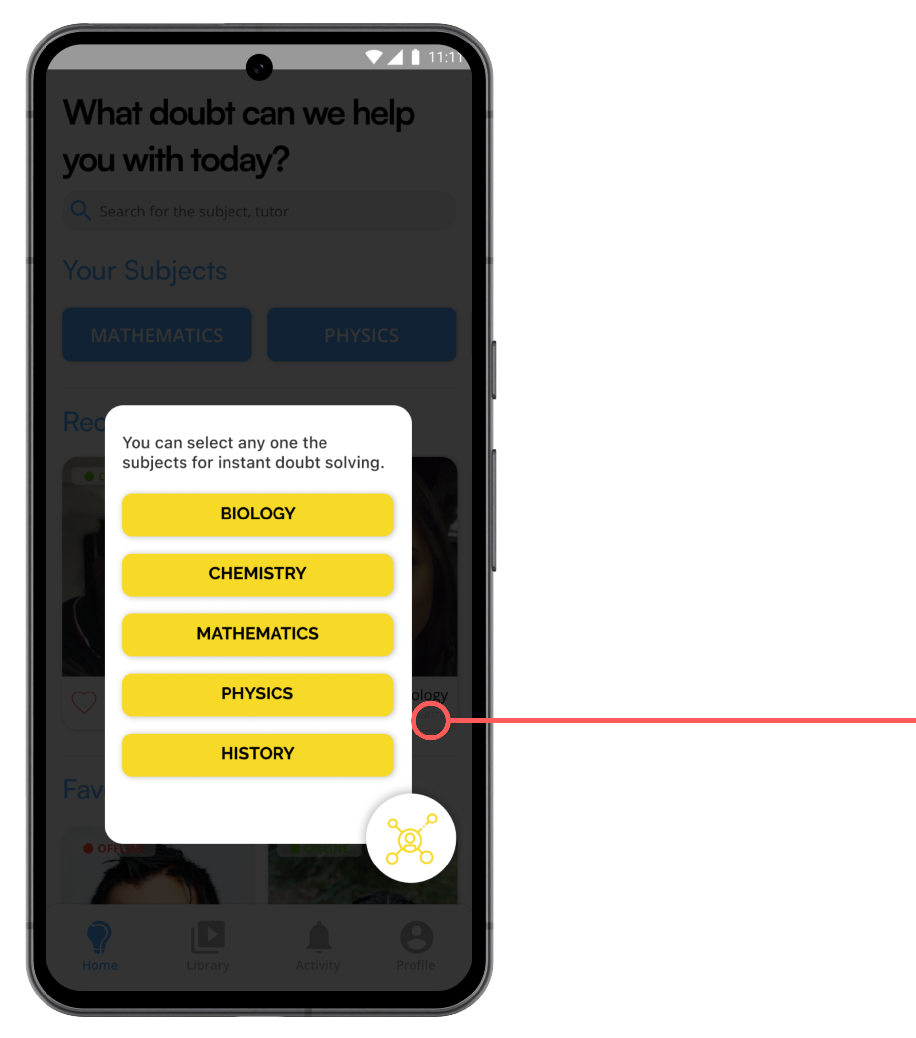
Once they tapped on the subject of their choice, the application would take them to a screen where they could upload the question, and they would randomly connect to a tutor for that subject who was available at that moment.
the problem
-
Many students felt devoid of choice when we randomly connected them to a tutor. 4 out of 5 of the test group said that since they were paying for the service, they wanted more control of the process and would at least expect the platform to provide them with some choice during the selection of tutors.
-
FABs are great, but they lack prominence. 2 out of 5 of the users failed to identify the button and its function and didn’t bother to click on it when we ran a moderated usability test.
iteration #3
Design Approach
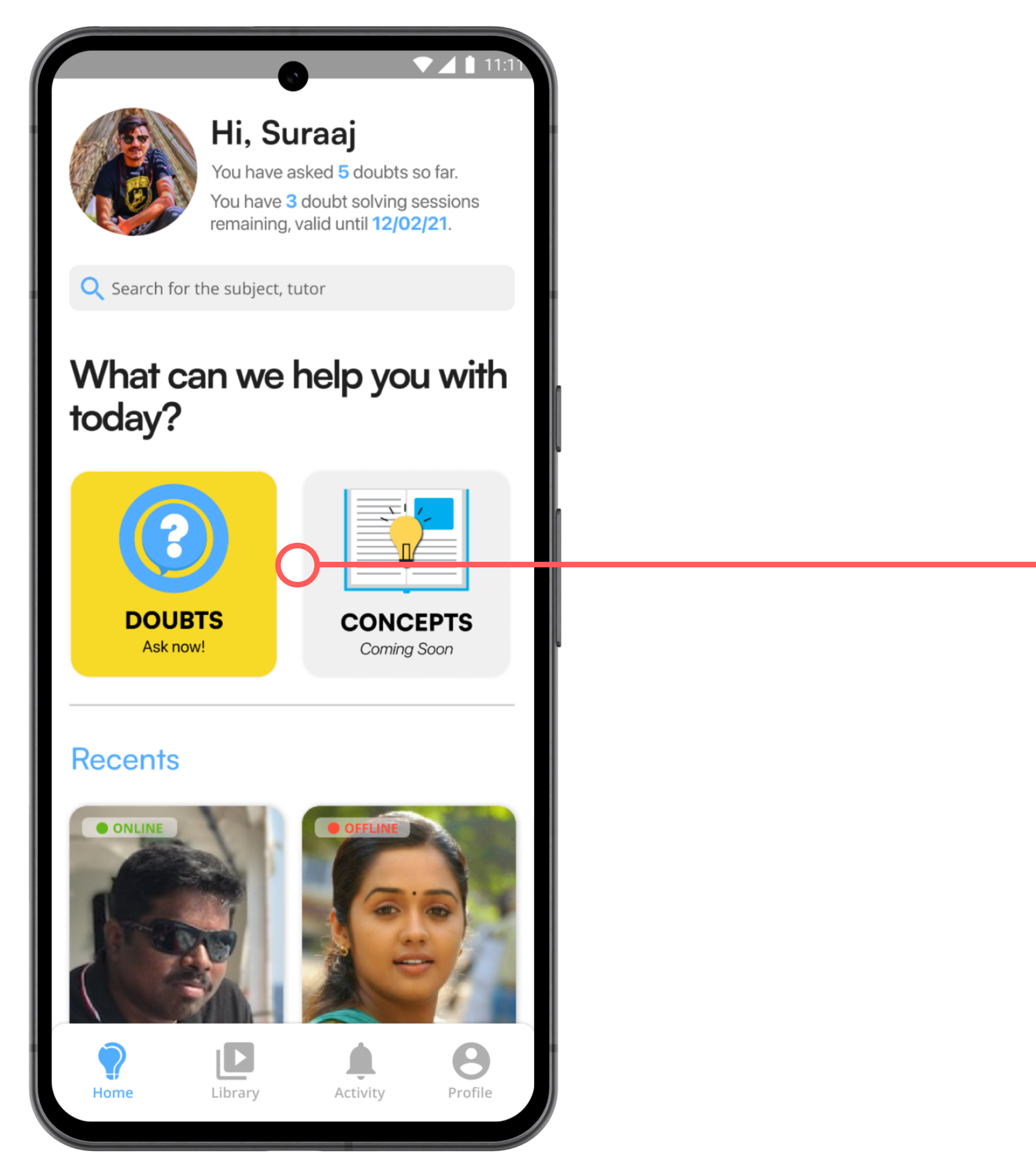
Based on the user feedback that I got, I removed the FAB and replaced it with more prominent CTAs.
I added two new buttons at the center stage of the home screen that showed the application's core function more prominently.

A business decision by the co-founders, the product manager, and the marketing team was made to show the subscription packages on the Home Screen.
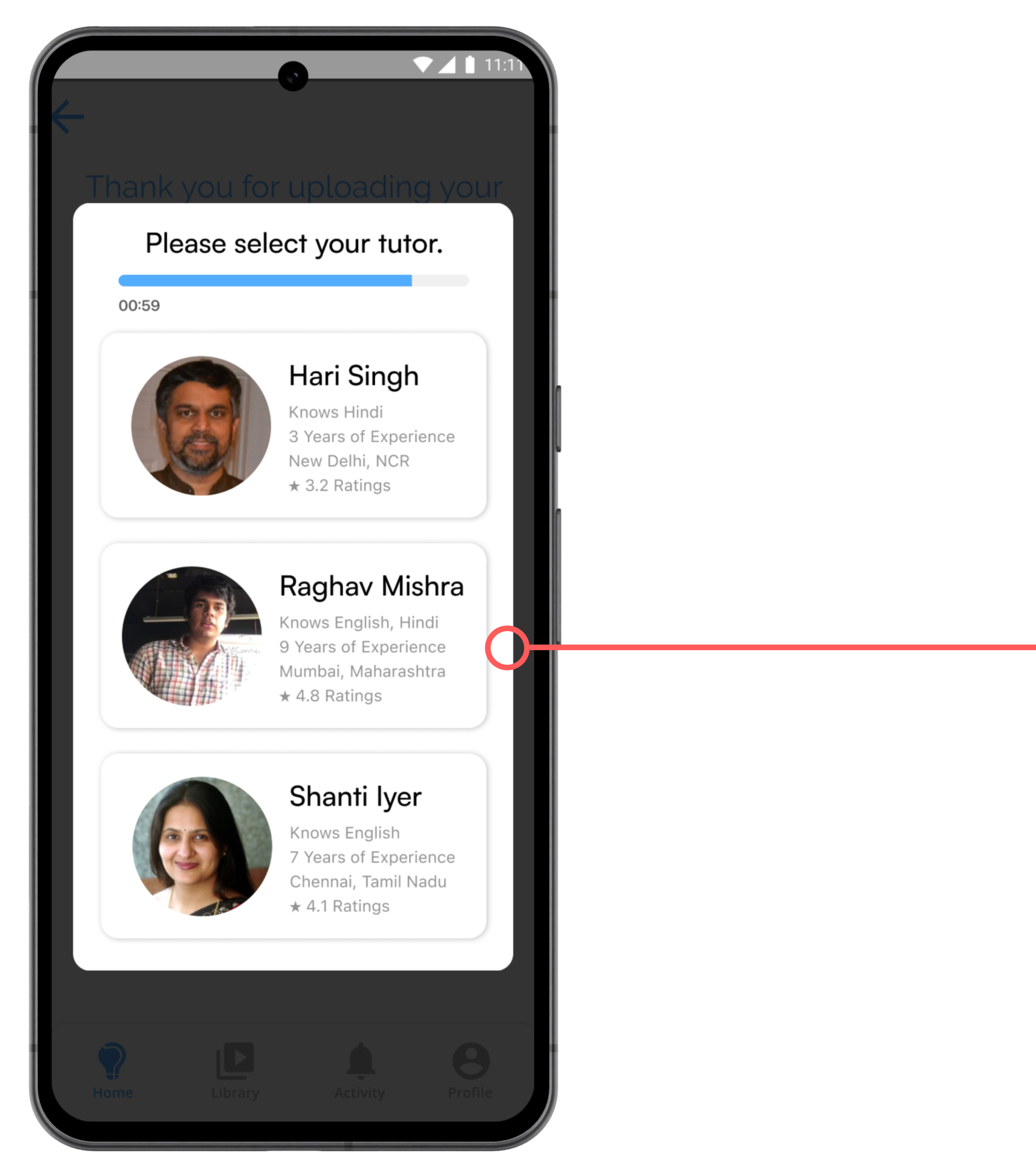
Again based on the feedback that I received for Iteration #2, I added a screen during the student-tutor connection procedure, that would let the users select a tutor from a list within a given time frame. If the student failed to do so, they would be connected randomly.
the problem
-
Although the visibility of the core functions improved drastically, 3 out 5 of the students felt that showing the tutors with whom they connected on the home screen didn’t add any value to their entire experience.
-
4 out of 5 students failed to identify the subscription cards at the bottom of the screen as CTAs and, therefore, didn’t feel the need to click on them, which would deter the business from generating revenue.
final iteration
Design Approach
The mental model that the users would use DoubtConnect for was to solve questions, and over time, I diverted from that mental model.
Therefore, showing tutors on the home screen was eliminated, and the focus was on question-solving by adding two completely new sections—Unsolved Doubts and Recent Doubts—to better suit the mental model of our users.
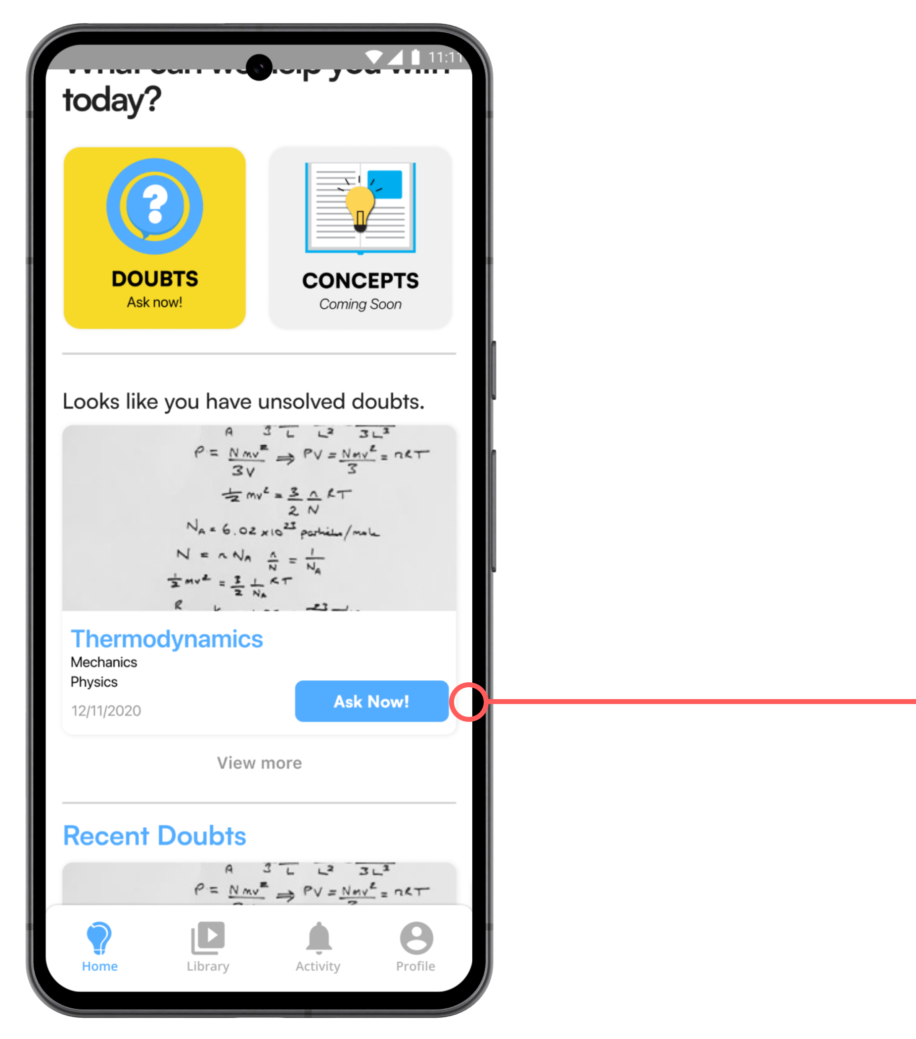
Students would often upload a question but were distracted by some other work and would leave the application.
To solve this issue I decided to add a section that showed the last doubt that they had uploaded but was not solved, to increase transaction rates.
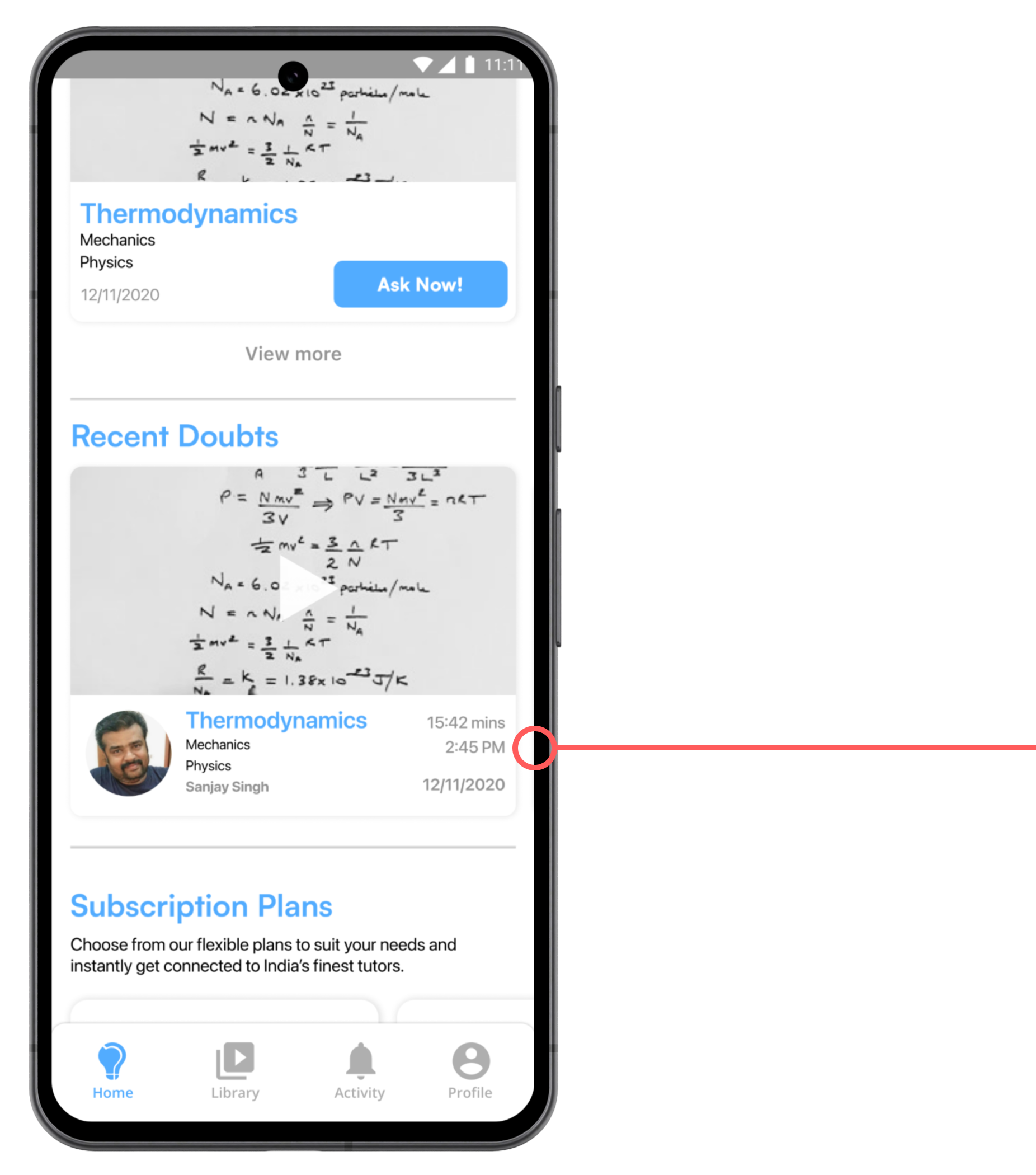
During our initial research, we found out that students like to revisit the questions they have asked previously during their revisions, so this section allows them to quickly glance through their last 3 doubts.
(Used Miller's Law and kept it below 5)
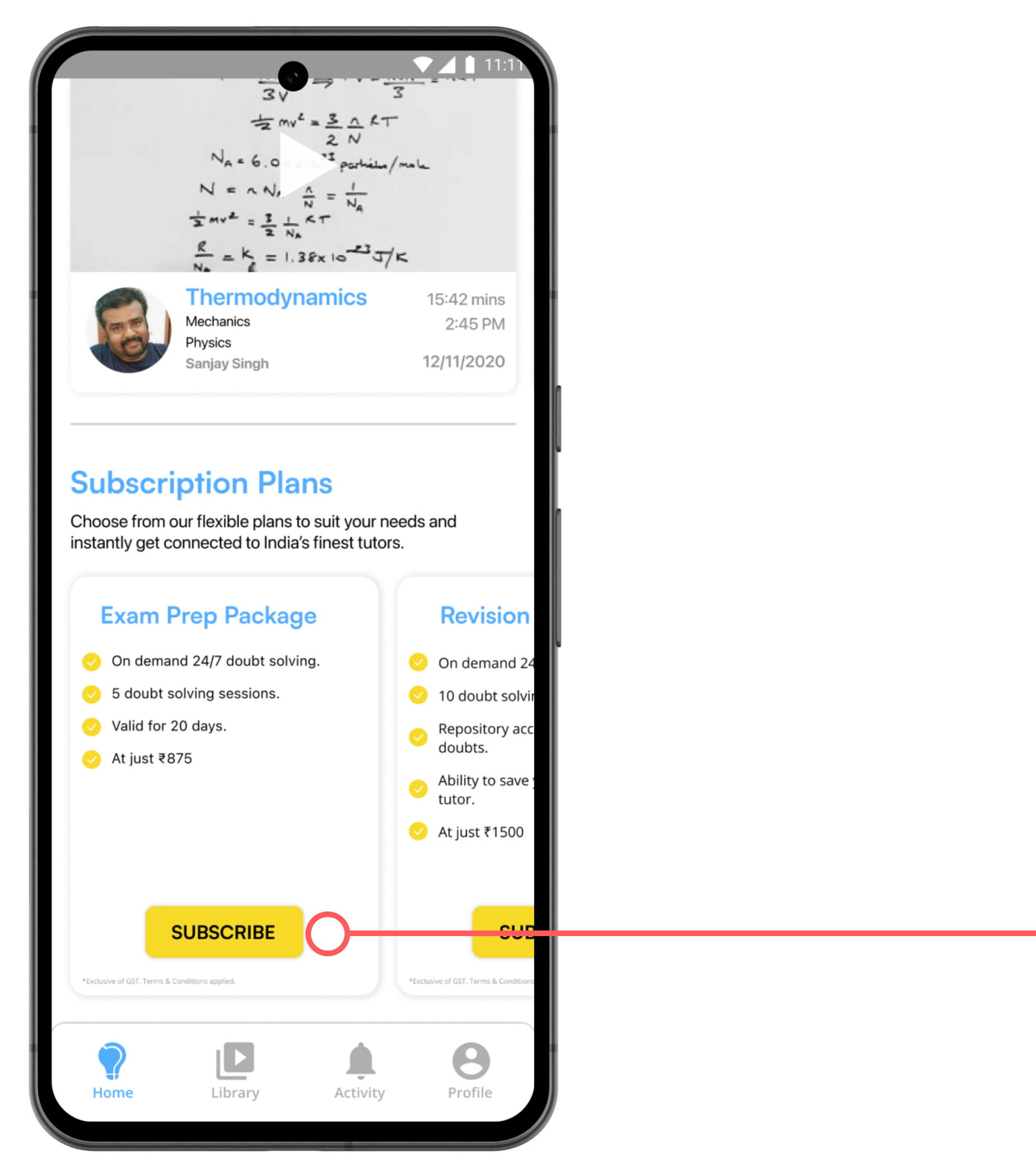
Since one of the key user feedback was that the cards showing the subscription plans didn’t portray any actions.
I added a Subscribe button to indicate that those cards can be clicked.
how students revisit previously solved questions
During the research phase, we discovered that students often want to revisit their questions that have been solved by the tutors.
As a result, I developed the Library Screen, which gathers and displays all the students' questions on the platform.
Design Approach
-
To solve the issue of showing more than one doubt on the Home Screen, I added the Unsolved Section in the Library Screen. Hence, the library was paginated into two sections- Solved and Unsolved Doubts.
-
Since students wanted both videos and images in the Library, I designed a card system where the user could select the type of media they wanted to view.
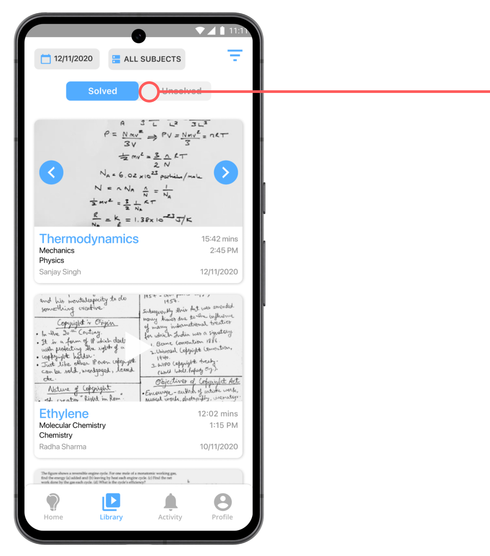
This section shows a list of all the questions that have been solved.
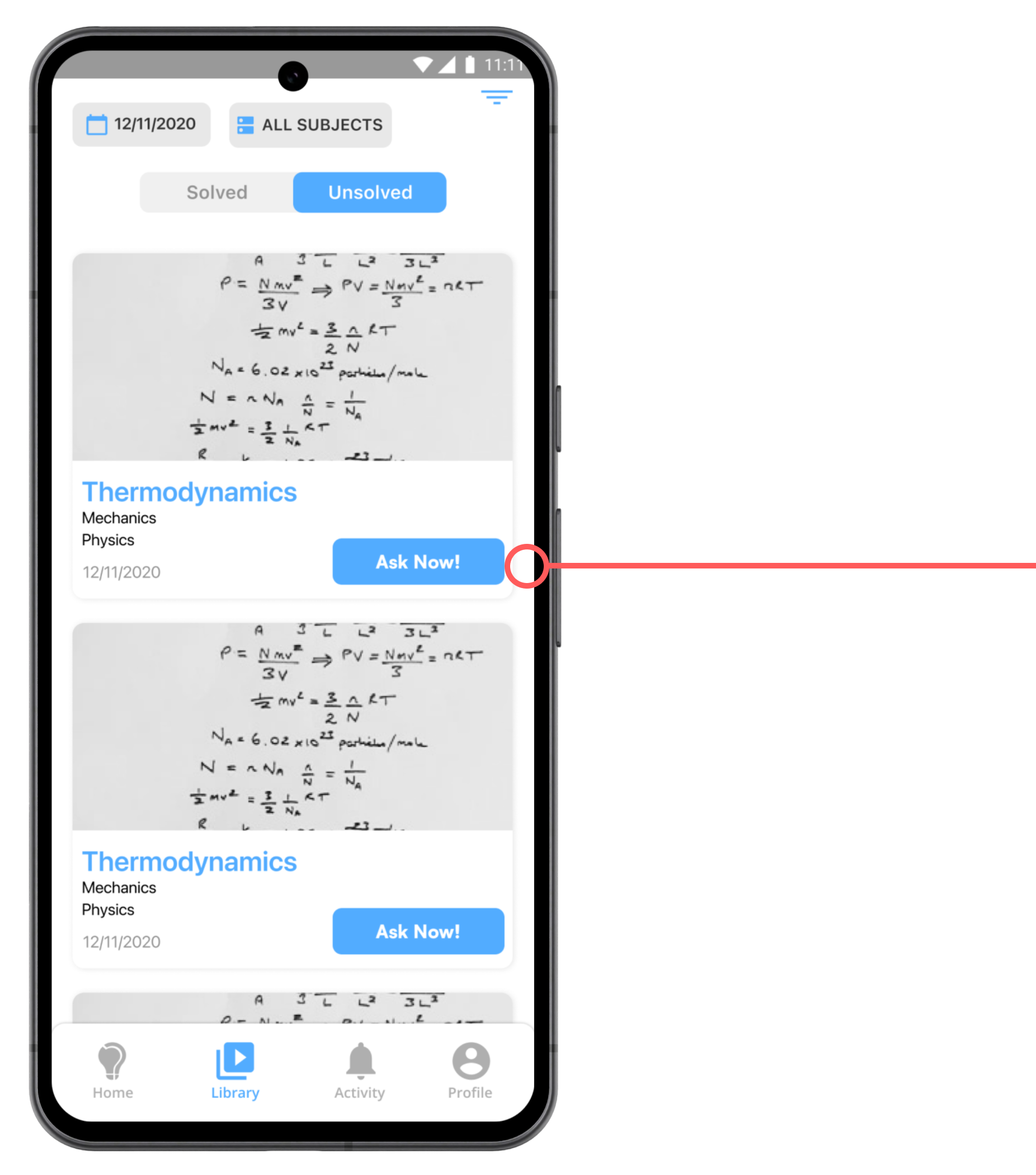
This section shows a list of all the questions that have not been solved. The user can go through this list and quickly tap on the "Ask Now" CTA to get the question solved by a tutor.
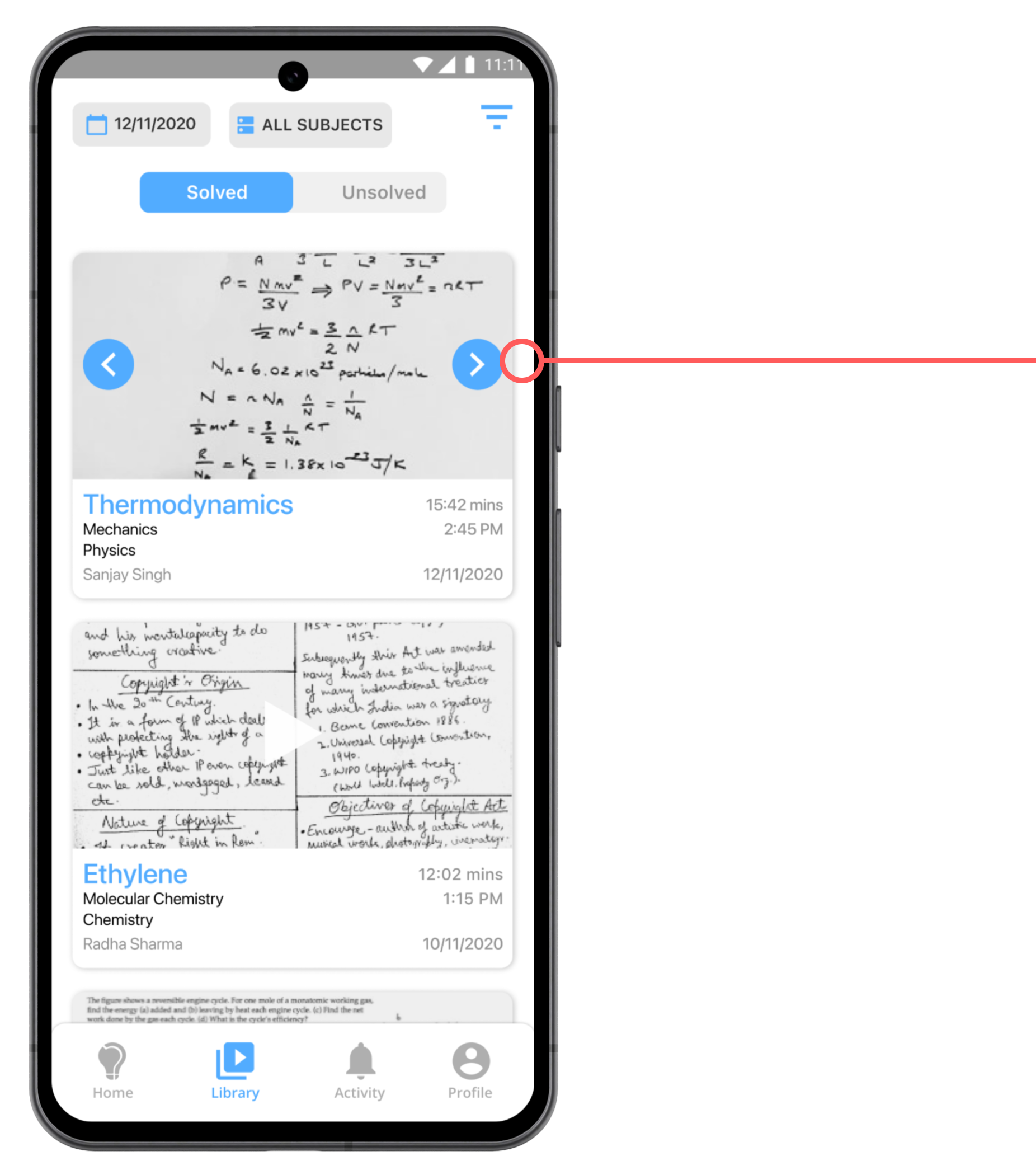
The user can tap on the side arrows to select the type of media (either images or video) they want to view.
implementing the design for production
As the design phase concluded, I handed the final design to the developers. Effective communication ensured a smooth hand-off, and I regularly collaborated with them, addressing issues through UI reviews and feedback. Additionally, I supported them by generating JSON codes for all the micro-interactions.


my takeaways
1
Engaging with an Agile Team for the first time illuminated the intricacies of product cycles and the significance of deadlines, granting me a more nuanced understanding of the development process.
2
The necessity to swiftly adapt designs and continuously refine product features in response to evolving requirements taught me to mitigate personal biases and prioritize user needs more effectively.
3
Looking ahead, should I have the opportunity to further contribute to this project, I aim to enhance the user interface of the application, addressing its readability and accessibility concerns.
