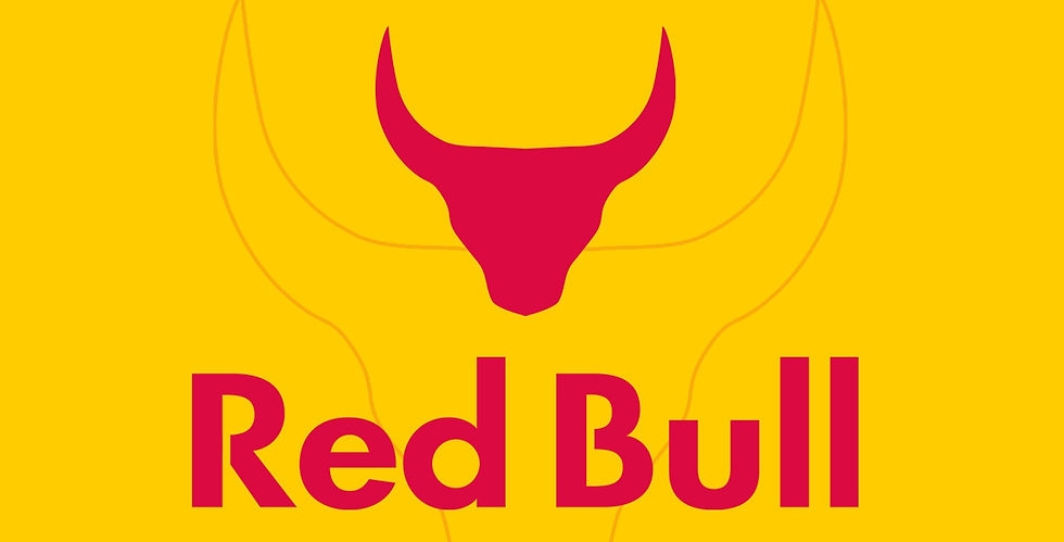
Red Bull-A Minimalist Approach
In this project, I work to understand the identity behind the minimalist design process. I try to rethink the brand identity of the famous energy-drink brand Red-Bull, from a minimalist perspective.


Tools Used:
Original Red Bull Logo is an intellectual property of Red Bull GmbH, Austria. All rights reserved with the company.
About Red Bull
Red Bull is an energy drink sold by Red Bull GmbH, an Austrian company created in 1987. Red Bull has the highest market share of any energy drink globally, with 7.5 billion cans sold in a year (as of 2019). Austrian entrepreneur Dietrich Mateschitz was inspired by an existing energy drink named Krating Daeng, first introduced and sold in Thailand by Chaleo Yoovidhya. He took this idea, modified the ingredients to suit Westerners' tastes, and, in partnership with Chaleo, founded Red Bull GmbH in 1987 in Chakkapong, Thailand. In Thai, daeng means red, and a krating (known in English as a gaur or Indian bison) is a large species of wild bovine native to South Asia. Yoovidhya's heirs own majority stakes in both brands, and they both use the same red bull on yellow sun logo while continuing to market the separate drinks to the respective Thai and Western markets. Red Bull is sold in a tall and slim blue-silver can. Originally only available in a single nondescript flavour and regular or sugar-free formulas, a line of "colour editions" with artificial fruit flavours was added to the line beginning in 2013. The Red Bull company slogan is "Red Bull gives you wings," occasionally "No Red Bull, no wings."
Objective
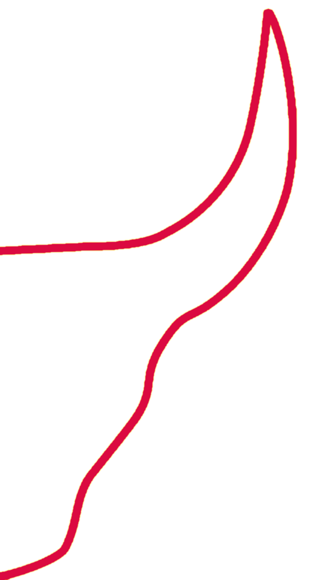
No matter how often logo design trends come and go, one style keeps rising back to popularity. Minimalist designs are simple, unique, and high in demand. Many big brands are ditching outdated logos for fresher minimalist designs. Minimalism is a creative approach that involves stripping away embellishments and reducing art to its simplest forms. The style is inspired by the idea that less is more. Yet, it would be best if you didn't confuse minimalism with being crude or plain. The point of simplicity is to highlight the raw, unadorned beauty of an art form without relying on shallow elements. The more you remove ornamentation, the more you reveal the ingenuity of design. The original Red Bull logo often looks cluttered because of too many elements in it. Therefore to bring in the minimalistic approach, I stripped off all the unnecessary elements of the logo. A simple approach to the logo was made where only the element that directly symbolized the brand was identified and implemented as the brand's logo mark. For the logotype, the original logotype was used, which uses the font Futura, and there are modifications to the letter R and B where the use of negative spacing can be seen.
Package Design
Product packaging design refers to the creation of the exterior of a product. That includes choices in material and form and graphics, colours and fonts used on wrapping, a box, a can, a bottle of any kind, or a container. Like any good design, packaging tells a story. Hence, for this project, I tried to reimagine the original packaging of the beverage Red Bull by introducing a new design that uses light and gradient to display a look that emphasises the freshness that one may receive after consuming the drink.
Also, during this part of the project, I learned about the various elements that form modern package design. I learned how to implement it in the best way possible to be aware of what the product contains. I also knew about visual attractiveness, that packaging must offer to appeal to customers through some uniqueness truly. Packaging designs need to capture attention from the shelf, but once they draw customers in, the product needs to hold their interest.